Drag & Drop
The Drag & Drop component allows you to create interactions where users drag elements to specific locations.
Use cases
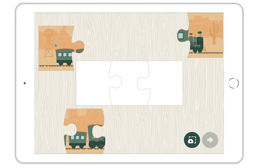
- Education: Create interactive exercises, such as matching images to words, categorizing elements, or completing diagrams.
- Gamification: Develop puzzle games, sorting challenges, or interactive quizzes where users must drag and drop objects to the correct location.
- Interactive forms: Build dynamic forms where users can reorganize elements, prioritize items, or create custom layouts.
- Data visualization: Create interactive charts or diagrams where users can manipulate elements to explore relationships.
Setting up the component
To create a drag & drop action, you need a moving object (the draggable) and a container (the drop zone). With the Drag & Drop component, you can create your draggable object, define a drop zone, and create actions related to the drag & drop.
Create the draggable object
In the Components window, click on Drag & Drop.
You can also use the Convert to Drag & Drop option available from the application menu (Layout > Convert to Drag & Drop) to transform an existing group of elements into a Drag & Drop component.
Double-click on the component to insert the object that will be draggable (for example, an image).
In the properties, check the Movement option to make the object draggable.
An object can be both draggable and a drop zone, allowing you to create complex drag-and-drop chains where objects can be moved between multiple locations.
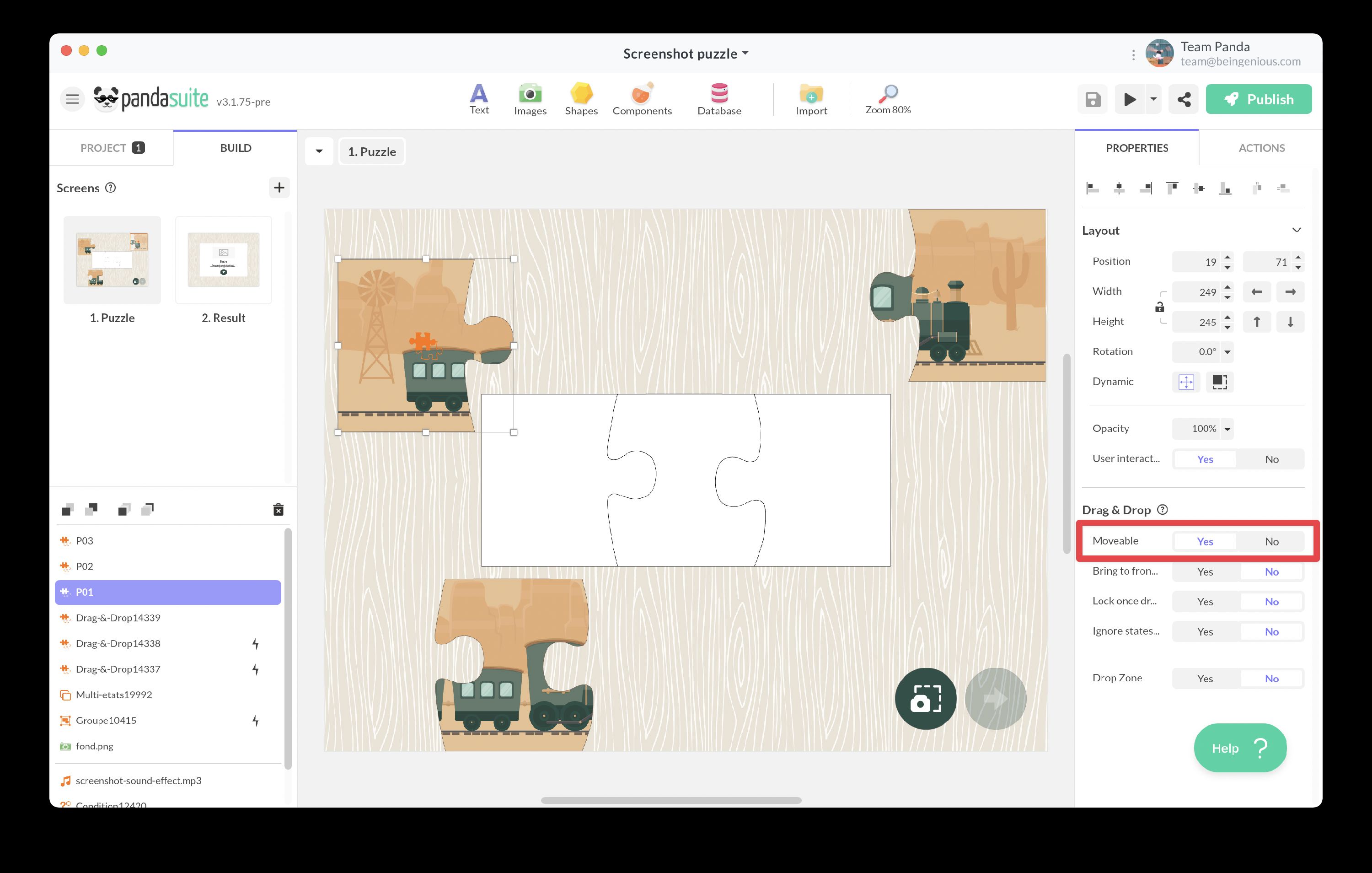
Draggable properties:
- Bring to front when dragging: The draggable object is placed above other objects during its movement, ensuring it remains visible while being dragged.
- Lock after drop: Once dropped in a valid drop zone, the object can no longer be moved. Useful for puzzle games or forms where positions should be final.
- Ignore states after drop: This option manages the display of a large list of draggable objects within a multi-state component. When enabled, the draggable remains in its dropped position even when the multi-state component changes states.
Define the drop zone
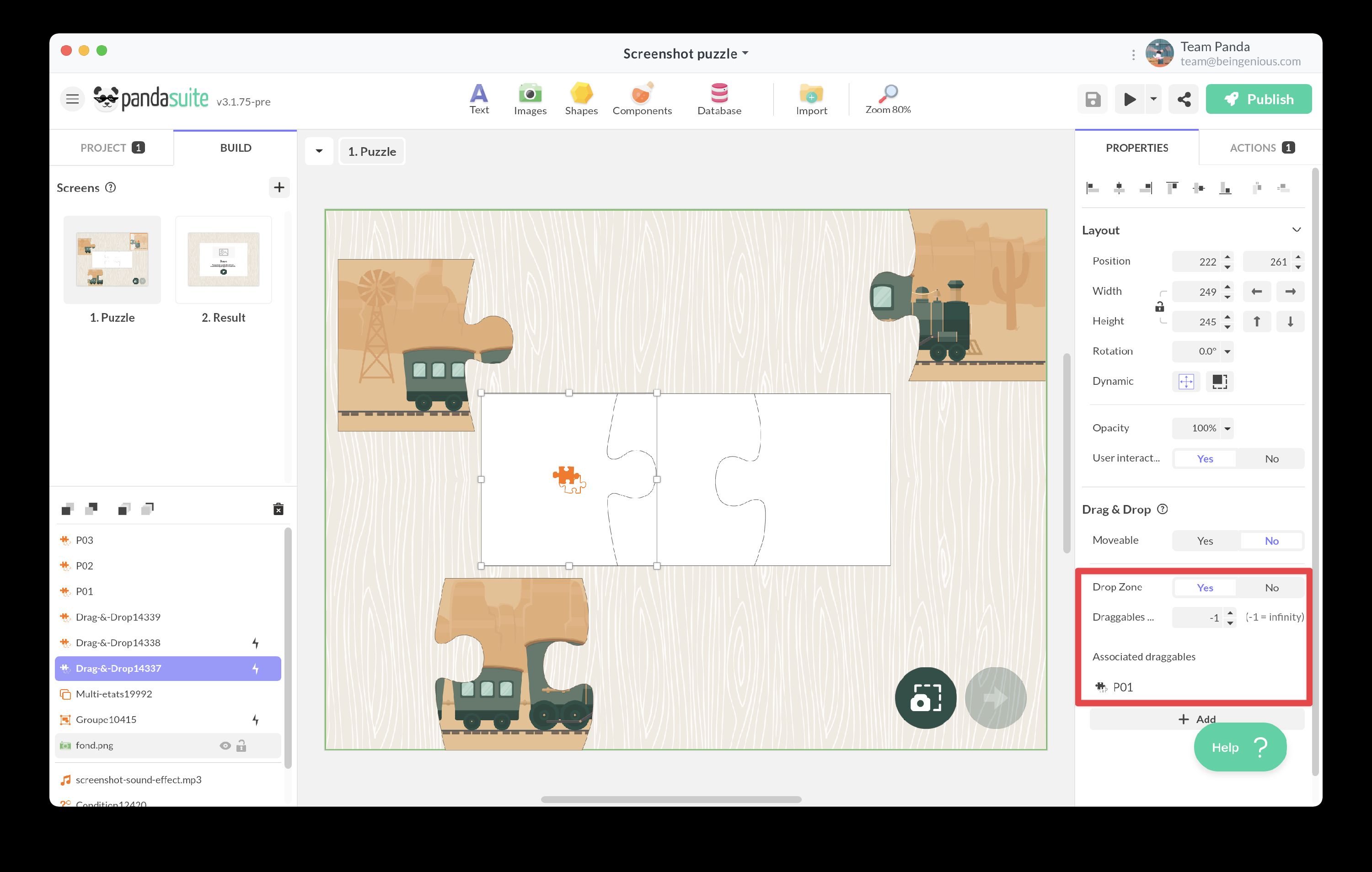
Add another Drag & Drop component. This component can be empty and placed over a graphic element that symbolizes the location.
In the properties, check the Drop Zone box.
Drop zone configuration:
- Limit draggables: Enable this option to restrict the number of draggable objects that can be dropped in this zone.
- Maximum draggables: Specify the maximum number of objects that can be placed in this zone. This field is only available when “Limit draggables” is enabled.
- Associated draggables: Click on + Add to select which draggable objects are accepted in this zone. An orange color visually indicates the selected draggable object. Only the specified draggables can be successfully dropped in this zone.
Create multiple drop zones with different accepted draggables to build sorting games or categorization exercises. For example, create zones for “Animals”, “Plants”, and “Objects”, each accepting only the appropriate draggables.
Interactive actions
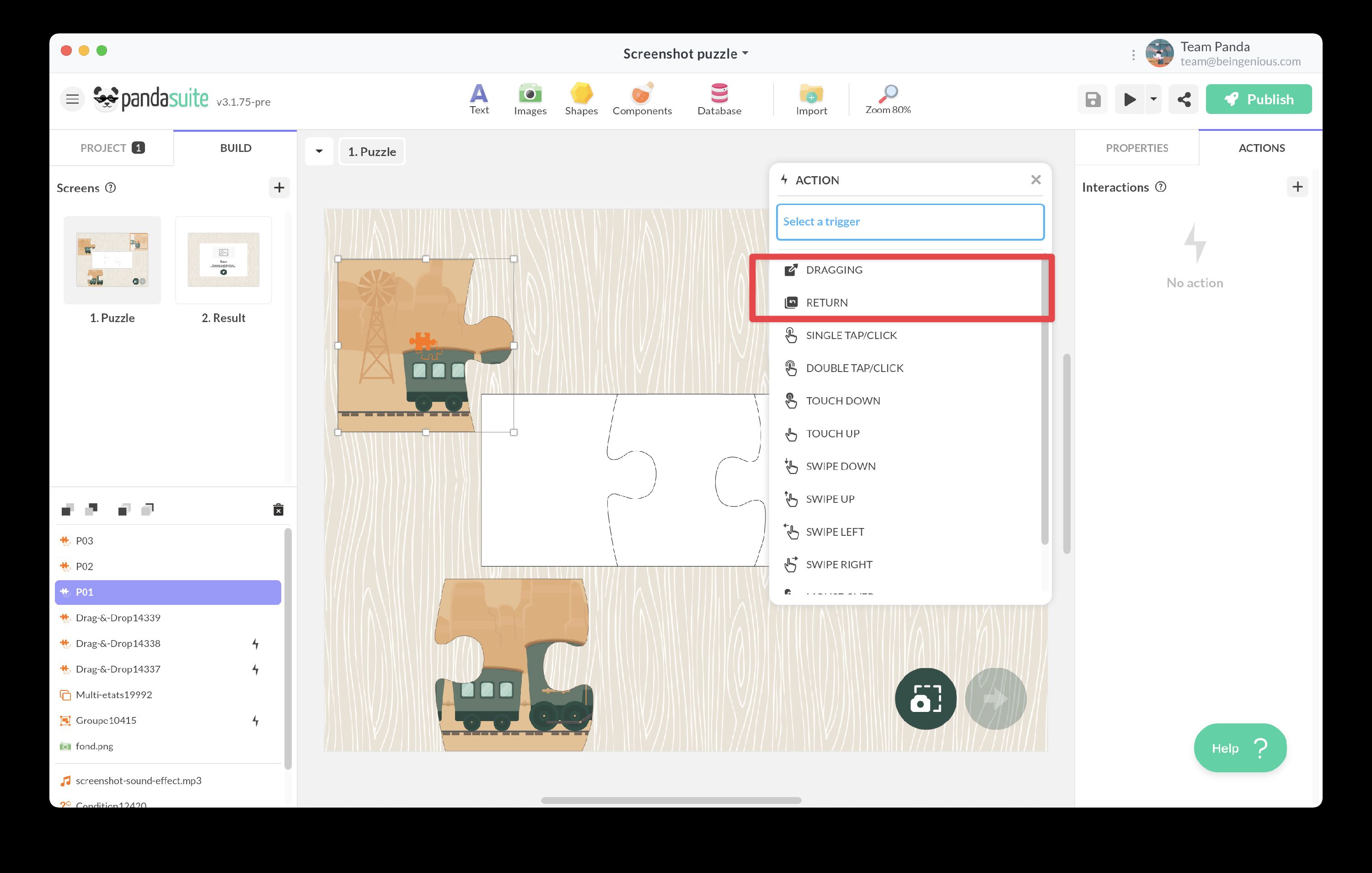
Trigger an action related to movement
You can trigger actions during the dragging process or when the object returns to its initial position.
Select your draggable object and add an action. Choose from the triggers:
- Dragging: Triggers when the user places their finger or cursor on the draggable object and begins moving it. Use this to provide visual feedback, play sounds, or update UI elements during dragging.
- Return: Triggers when the user releases the draggable object outside of any valid drop zone, causing it to return to its initial position. Useful for providing feedback about invalid drops or tracking failed attempts.
Trigger an action after dropping
To create actions related to drop zone interactions, select your drop zone.
Choose from the triggers:
- Dropping {draggable_name}: Triggers when the user releases the draggable object and it is successfully placed in the drop zone. This is the most common trigger for validation, scoring, or advancing to the next step.
- Entering {draggable_name}: Triggers when the user moves the draggable object into the drop zone area (while still dragging). Use this to highlight the drop zone or provide visual feedback about valid placement.
- Exiting {draggable_name}: Triggers when the user moves the draggable object out of the drop zone area (while still dragging). Use this to remove highlights or reset visual feedback.
If your drop zone accepts multiple draggable objects, these three triggers will be available for each accepted draggable. This allows you to create different responses depending on which object is dropped.
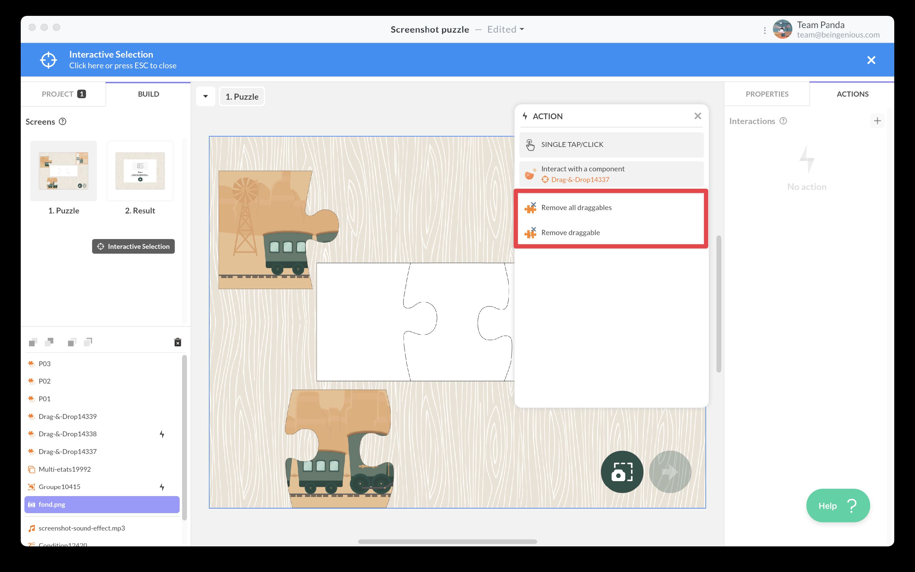
Remove draggables
You can create an action to automatically reset draggable objects to their original position. This is useful for “Reset” or “Try Again” buttons in games and exercises.
Select a trigger (e.g., a button) and choose the action Act on a component > Drag & Drop {drop zone}.
You have two options:
- Remove all draggables: Removes all objects currently in the drop zone and returns them to their original positions.
- Remove draggable: Removes a specific draggable object from the drop zone and returns it to its original position.
Exposed properties
The Drag & Drop component exposes the following data that can be bound to other components:
For drop zones:
- Draggable(s) dropped: The list of draggable objects currently placed in the drop zone. This property can be used to bind data to other components and create dynamic interfaces that respond to drag-and-drop interactions, such as progress indicators, counters, or visual feedback based on the state of drop zones.
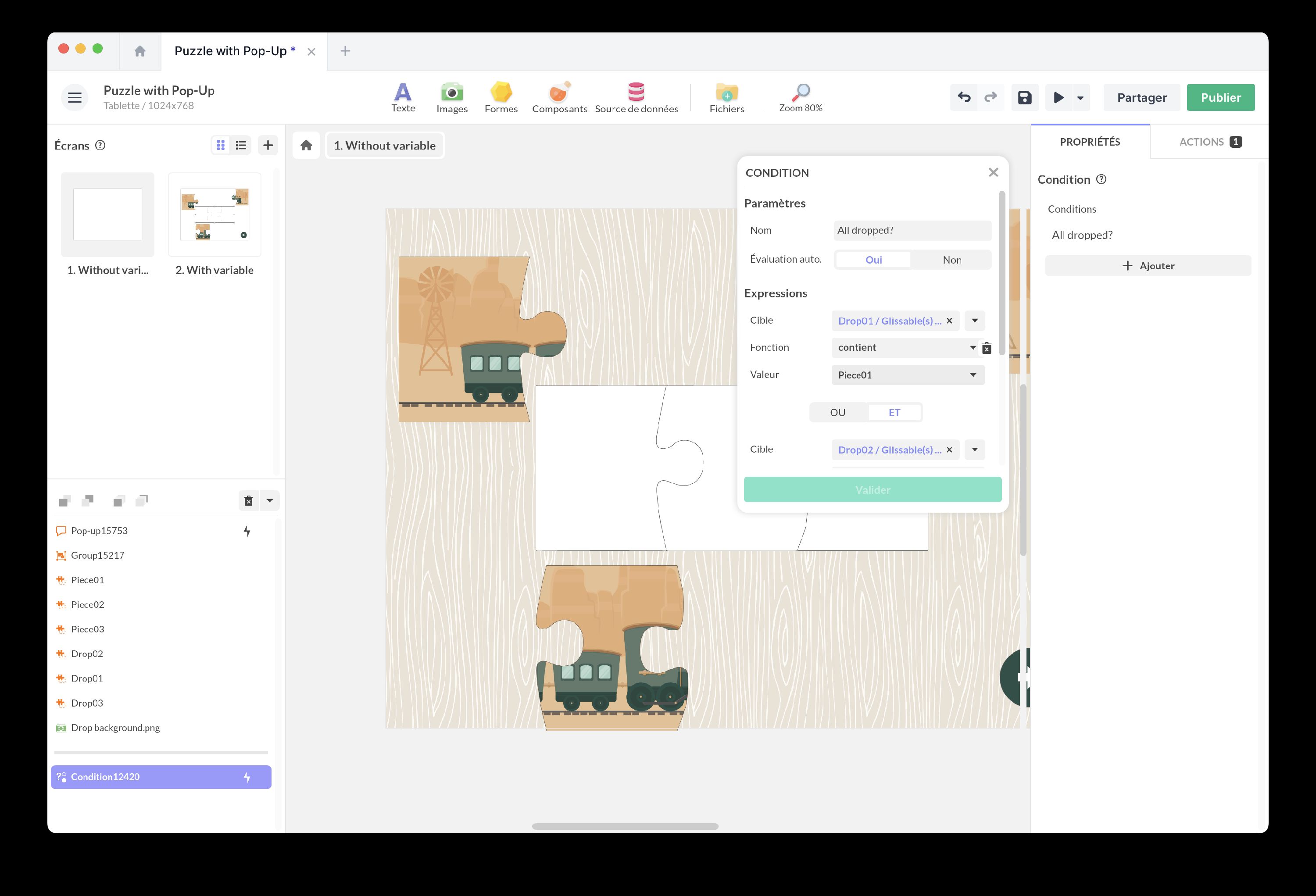
Logic and conditions
In puzzles or activities where you need to verify whether pieces have been placed in the correct location, adding validation logic is essential. The Condition component provides a simple and effective solution for checking whether each piece has been dropped in the correct zone.
Setting up validation:
- Add a Condition component to your screen.
- Define the condition “All pieces have been placed correctly” by checking each drop zone.
- For each drop zone, verify that it contains the correct draggable object.
- Associate an action when the condition is met, such as displaying a success message, playing a celebration animation, or advancing to the next screen.
Tracking progress:
If you want to track overall progress (e.g., how many pieces have been correctly placed out of the total), you can use variables and store them in the Datastore. This method requires managing cases where users move pieces back from drop zones.
For scoring systems, increment a variable each time a correct drop occurs, and decrement it when a piece is removed from a correct drop zone. This gives you real-time progress tracking.
Best practices and tips
Large list of draggables
If you have a large list of draggable objects on the same screen, use a Multi-state component organized as tabs or panels. Place the draggable objects and drop zones within this component, with each state corresponding to a different panel.
This approach:
- Reduces screen clutter and improves performance.
- Allows users to navigate through categories of draggables.
- Works well with the Ignore states after drop property to keep dropped objects visible across state changes.
Visual feedback
Provide clear visual feedback throughout the drag-and-drop interaction:
- During drag: Use the Dragging trigger to scale, rotate, or add a shadow to the draggable object.
- On enter: Use the Entering trigger to highlight or enlarge the drop zone when a valid object approaches.
- On success: Use the Dropping trigger to play a sound, show an animation, or change the appearance of both the draggable and drop zone.
- On failure: Use the Return trigger to shake the object or play an error sound when dropped in an invalid location.
Accessibility considerations
- Ensure draggable objects and drop zones have sufficient size for touch interaction (minimum 44x44 pixels recommended).
- Provide visual indicators showing which objects are draggable and where they can be dropped.
- Consider adding alternative interaction methods (e.g., tap to select, tap to place) for users who may have difficulty with drag gestures.
Additional resources
Articles
Video tutorials
Create a Drag and Drop Game with Animations
Watch this video to learn more about the topic and see practical examples.
→ Watch the videoCreate a Drag and Drop Game with Conditions
Watch this video to learn more about the topic and see practical examples.
→ Watch the videoTemplates
Puzzle with Pop-up
Add this template to your account in just a few clicks. Edit and customize it freely.
→ Add this template to your accountDrag and Drop Game with Conditions
Add this template to your account in just a few clicks. Edit and customize it freely.
→ Add this template to your account