Camera
Control the camera from your app: take a picture without leaving the app and display it in your interface.
Use cases
The Camera component is particularly useful for:
- Document capture: scan ID cards, receipts, or forms.
- User-generated content: allow users to share photos within your application.
- Event photo booth: create photo experiences at events with custom frames.
- Product catalogs: enable users to photograph items to add them to a list.
- Inspection and reporting: capture images for inspection or maintenance reports.
Setting up the component
- Open the Components panel.
- Drag and drop Camera into your screen.
A graphic object is automatically created: this area allows you to display the camera view from your application. If you do not want to display this view, place this component outside the screen.
Component features
Properties
In the Camera component properties, you can customize its behavior:
| Property | Description |
|---|---|
| Orientation | Choose between Front camera (selfie) or Back camera (main photo). |
| Camera Type | On devices with multiple cameras, select Standard, Ultra Wide (wide angle), or Telephoto. By default, the Standard camera is used. |
| Quality | Set the quality of the captured photo: Optimized (quality/performance balance) or Best (maximum quality). |
Place the camera graphic object outside the screen if you want to capture photos without showing the preview to the user.
Trigger events
You can use the Camera component to trigger actions. Select your component and open the Actions window. The available triggers are:
- Photo taken: triggers immediately after a photo is captured.
- Frame changed: triggers for each new frame captured by the camera in real-time (before taking a photo).
This allows you to trigger any PandaSuite action (change screen, display pop-up, save to variable, etc.).
The Frame changed trigger is particularly useful for combining the camera with image recognition. Unlike the classic “Open camera” action from the Recognizer (which forces full screen mode), this approach allows you to design your own interface with custom overlays, targets, and visual indicators.
Associated actions
You can act on the component via the Interact with a component action:
- Take a picture: triggers photo capture from the selected camera.
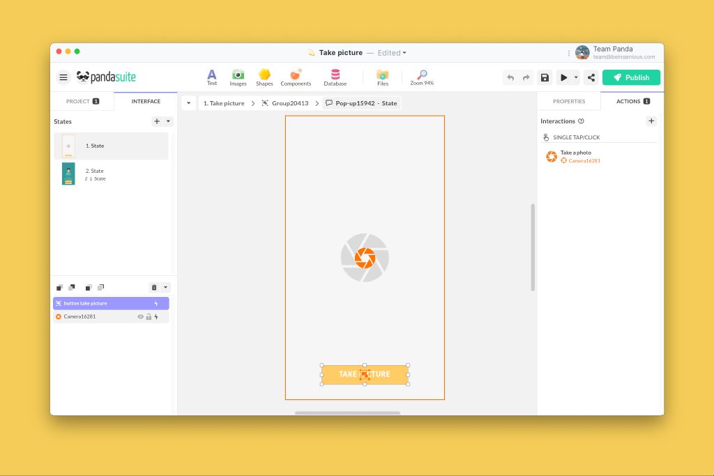
Take a photo
To take a picture, select a button and choose the action:
Display the captured photo
To display the photo, connect an image source to this component via data binding.
- Insert an Image in your interface (it serves as a template and will be automatically replaced).
- Select this image, click on Source in the properties.
- Set the path: 1 From a component→2 Camera→3 Image
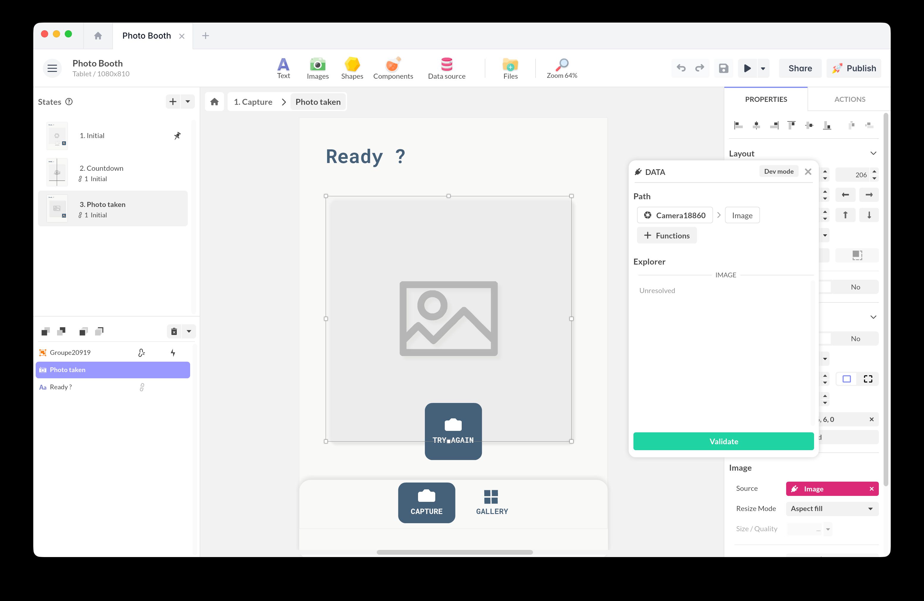
The photo displays automatically after capture.
Best practices and tips
- User permissions: ensure your application requests camera access permissions.
- Image quality: captured photos are optimized for a balance between quality and performance.
- Visual feedback: add a sound effect, vibration, or animation after capture to confirm the action.
- Local storage: photos are stored locally in the application. Use the HTTP component to send them to an external service.
- Compatibility: test on different devices to verify the availability of different camera types (ultra wide, telephoto).
Practical examples
Photo booth
Create an event photo booth where guests take a selfie and instantly see the result on screen.
- Insert the Camera component with Front orientation (selfie).
- Create a button with the action: .1 Interact with a component→2 Camera→3 Take a picture
- Display the captured photo: insert an Image, then bind its Source to .1 From a component→2 Camera→3 Image
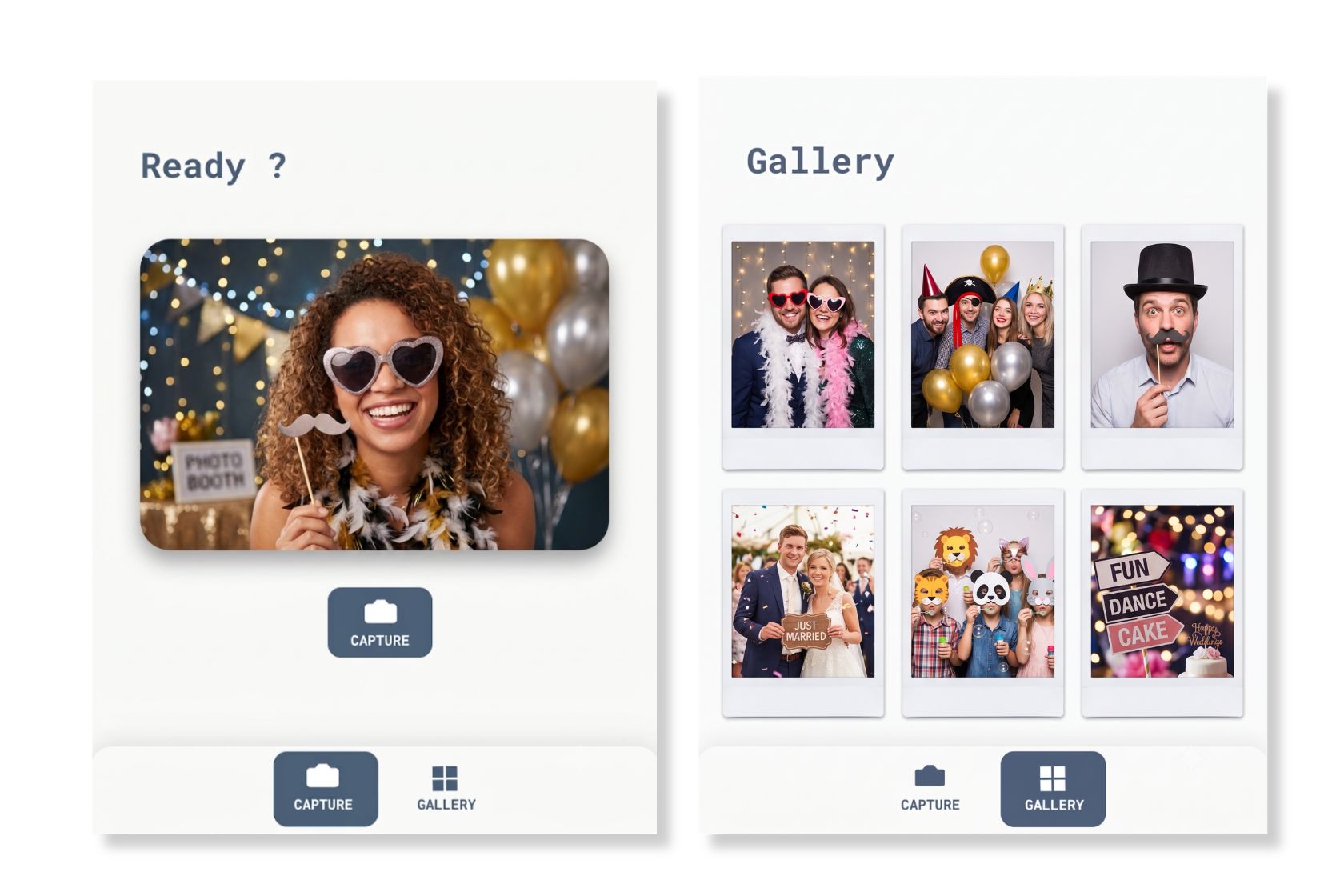
Photo Booth
Add this template to your account in just a few clicks. Edit and customize it freely.
→ Add this template to your accountAdd a custom frame (optional)
To brand the result, place a decorative frame (a border, logo, or event hashtag) as a graphic overlay on top of the displayed photo.
The Camera captures only the camera image, not the overlay placed on top. To save a final picture that includes the frame, capture the composed view with the Screenshot component.
- Add a Screenshot component and set its Properties to capture the component (or screen) that holds both the photo and the frame.
- Trigger it right after capture: .1 Photo taken→2 Interact with a component→3 Screenshot→4 Take a photo
- Bind a new Image to the Screenshot source to display, store, or share the framed photo.
Send photo to an external service
Your photo is stored locally in the application, but you can send it to another service via the HTTP component.
Steps:
- Configure an HTTP component.
- Add a data binding from Camera > Image to the HTTP request body field.
- Trigger the send after capture: 1 Photo taken→2 Interact with a component→3 HTTP→4 Send
Image scanner with custom interface
Combine Camera and Image Recognition to create a custom scanning interface (without full-screen mode).
- Add the Camera component (back orientation) and the Image Recognition component.
- Overlay your graphic interface (frame, target, instructions) on top of the camera view.
- Connect them: 1 Frame changed→2 Interact with a component→3 Image Recognition→4 Detect
- Define your reactions: MATCH [image.jpg] → action of your choice.
The Frame changed trigger activates up to 30 times per second. Favor lightweight actions to avoid slowdowns.