Responsive design best practices
Discover how to structure your project for seamless responsiveness. These insights will save you a ton of time.
We recommend checking out the Responsive design article first.
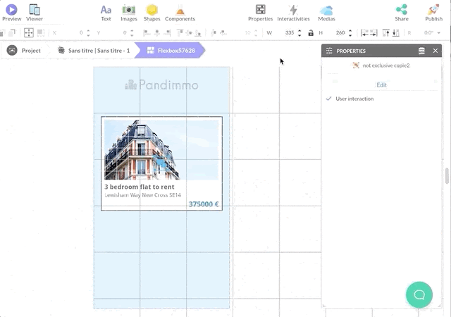
Automatically Adjust Content with Flexbox
The Flexbox component is a container that auto-adjusts its scroll size based on its content, aligning items evenly along a primary axis (horizontal or vertical).
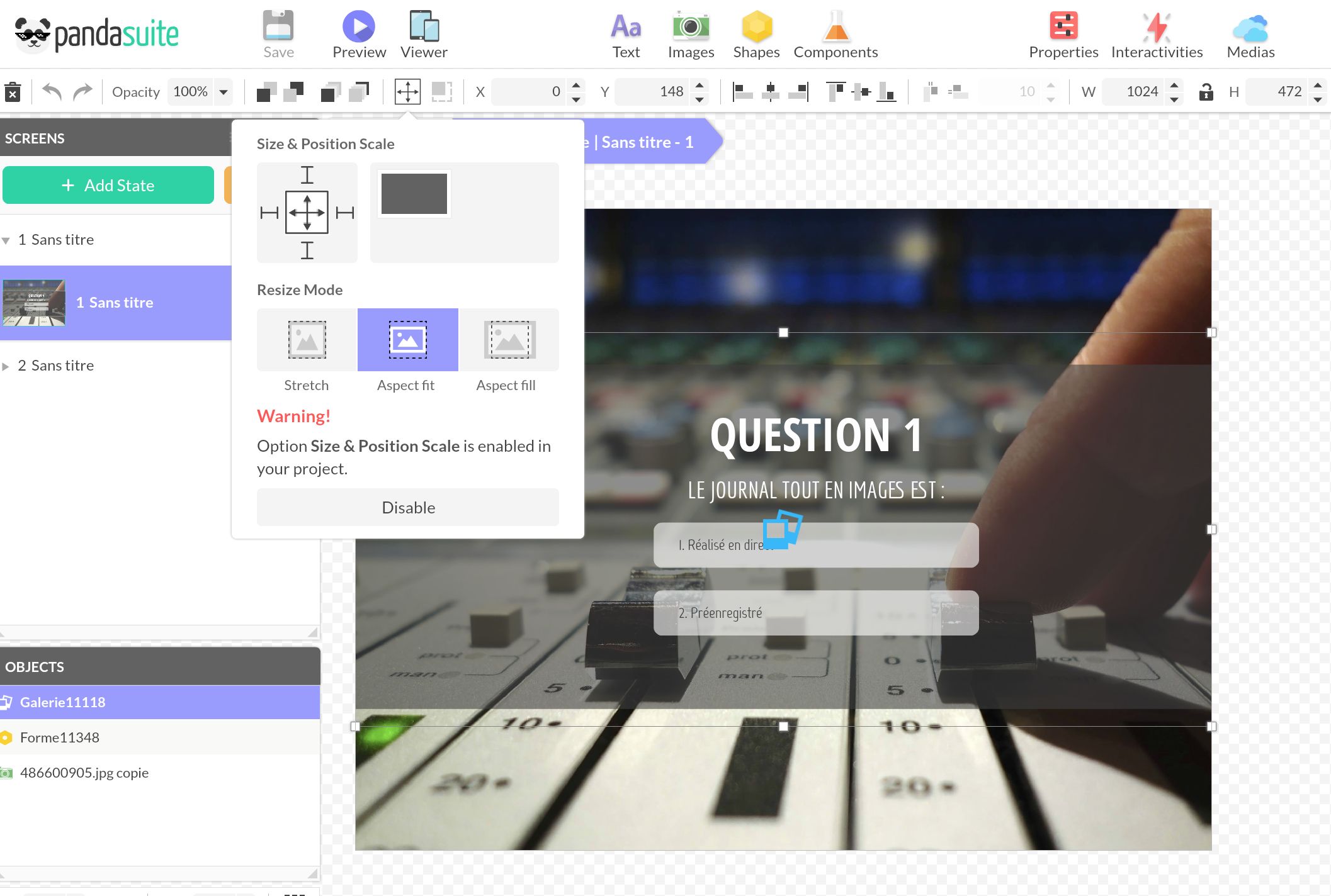
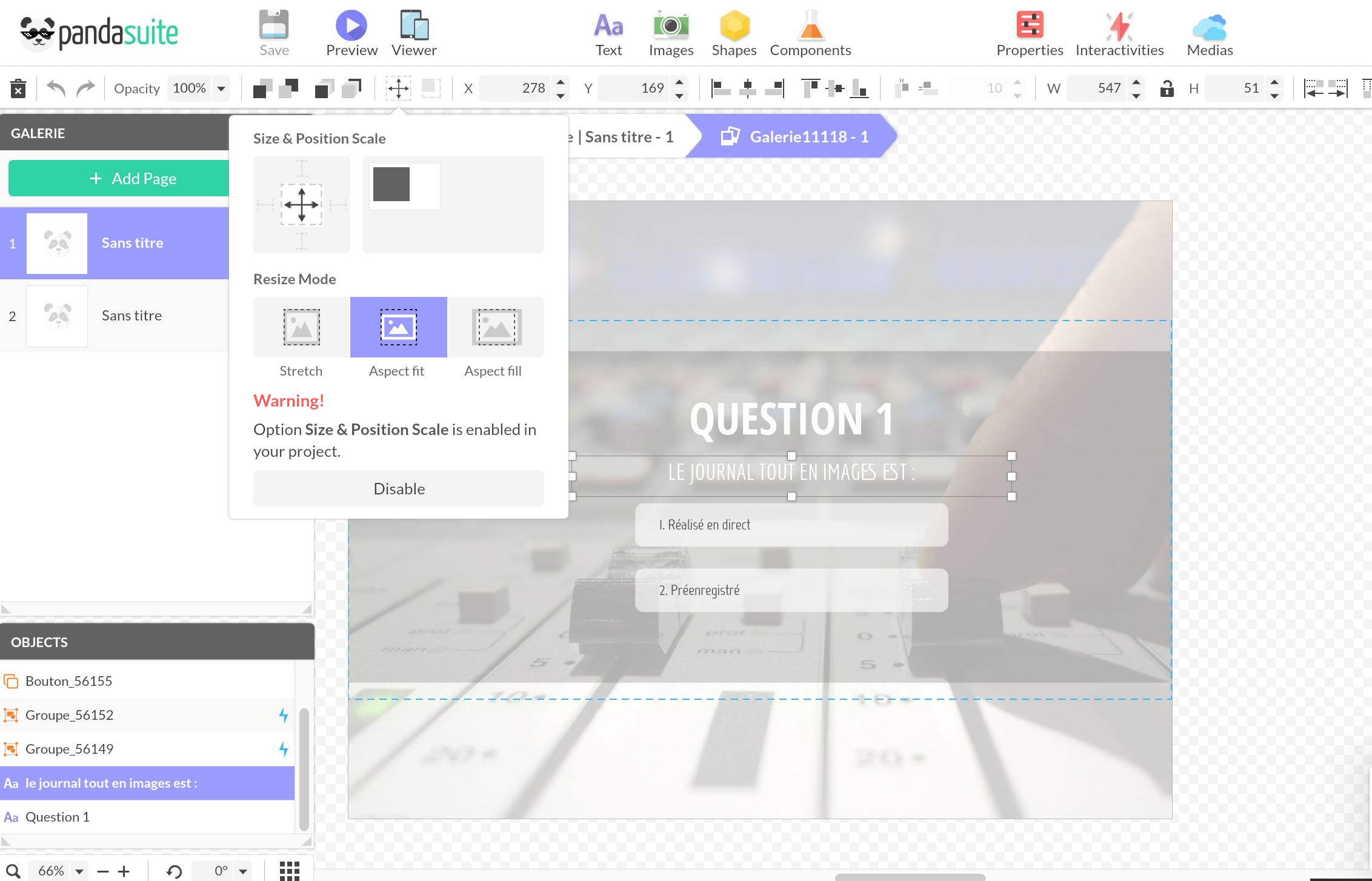
It auto-adjusts (Aspect Fit), letting you position “child” items without fretting over responsiveness. There will always be a 5 px gap between items, regardless of their size adjustments. The items dictate their own size changes.
Position your items within. Pick the gap between items and the direction (vertical or horizontal). Flexbox even lets you form a grid: just activate the Wrap feature on the container, allowing items to line up across multiple rows if needed.
Use an Adaptable Background
A simple trick for a responsive layout is to fit the background to the screen’s dimensions.
If the backdrop is a shape, stretch it directly (Stretch).
For image backgrounds, set them to the Aspect Fill setting to maintain the image’s proportions, ensuring it covers the screen flawlessly, even if it extends beyond its borders.
Center Items on Every Screen Size
With a responsive background, you can center all your items and retain your initial layout.
Group all your items together. The group’s size matters as it’s what will be centered on the page. Opt for the Aspect Fit setting and a middle position using the Size & Position Scale choices.
Keep Content Clear of a Fixed Bar
When a screen has a fixed element on top of it, such as a navigation bar or header placed in a foreground, that foreground floats over your screen and does not reserve space on its own. Left alone, your content runs underneath it and gets hidden on some screen sizes.
The fix is to reserve the bar’s space yourself, then let your real content scale inside what remains:
- Set your screen to Stretch so it fills the device and you can position content against its edges.
- Group the meaningful content (logo, title, text, button…) together.
- Position and size that group so it stops above the bar, leaving a safe zone the foreground never overlaps.
- Set the group to Aspect Fit. It now scales as one block inside that safe zone, keeping its proportions and staying clear of the bar at any screen size.
The payoff: you tune one group instead of every element, and nothing slips under the bar.