Understand states
States are one of the fundamentals of PandaSuite. They allow you to create animations and interactions by varying the appearance and content of your screens without creating new pages.
What is a state?
A state is a specific version of your screen or component. Imagine a button that changes color on hover, a menu that opens and closes, or an information panel that appears: each version represents a different state.
Moving from one state to another creates an animated transition, enriching the user experience without multiplying screens.
Examples of state usage
States are useful for:
- Showing or hiding content: a dropdown menu, an information window, additional details
- Creating hover effects: a button that changes style when you mouse over it
- Animating visual transitions: a logo that moves, an element that fades in
- Managing different interface versions: switching between themes or display modes
- Creating step sequences: a tutorial, a questionnaire, a presentation
Where to find states?
States are available at multiple levels in PandaSuite:
- Screen states: to create global variations of an entire screen
- Multi-state component: to animate objects or groups of objects locally
- Foregrounds and backgrounds: to create variations on these transversal elements
- Pop-up component: to create entry and exit effects
Types of states: linked or blank
When you create a new state, you have a choice between two options:
Linked state (recommended for transitions)
A linked state is a copy of an existing state. Both states remain connected through automatic links. A link symbol appears below the name to indicate the reference.
Why use a linked state?
- To create animated transitions between two versions of a screen
- Objects remain synchronized: if you modify an element in the parent state, the change automatically applies to the linked state
- You only change what needs to be different, the rest stays identical
Blank state (for independent variations)
A blank state is a completely independent new state, with no links to other states. Use it when you want to create a totally different version without animated transition.
The principle is the same within a Multi-state component.
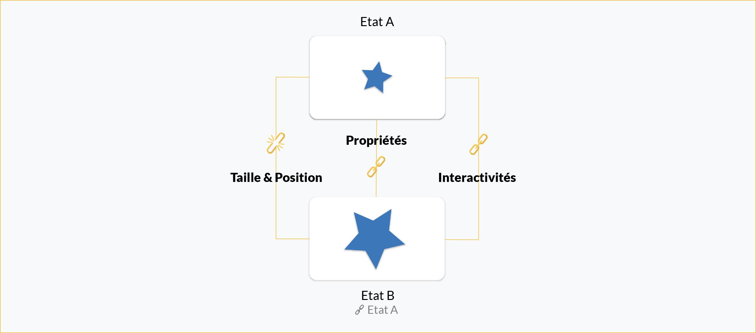
How do linked states work?
When you create a linked state, three types of links are automatically established for each object:
- Size & Position: the dimensions and location of the object
- Properties: color, opacity, mask, etc.
- Actions: interactions defined on the object
Working principle
By default, everything is synchronized: if you modify an object in the parent state, the change automatically applies to the linked state.
To create a transition: modify a property of the object in the linked state (for example, change its position, size, or opacity). When moving from one state to another, the object will progressively animate between the two versions.
Managing links between states
You can visualize and restore links from the Objects window:
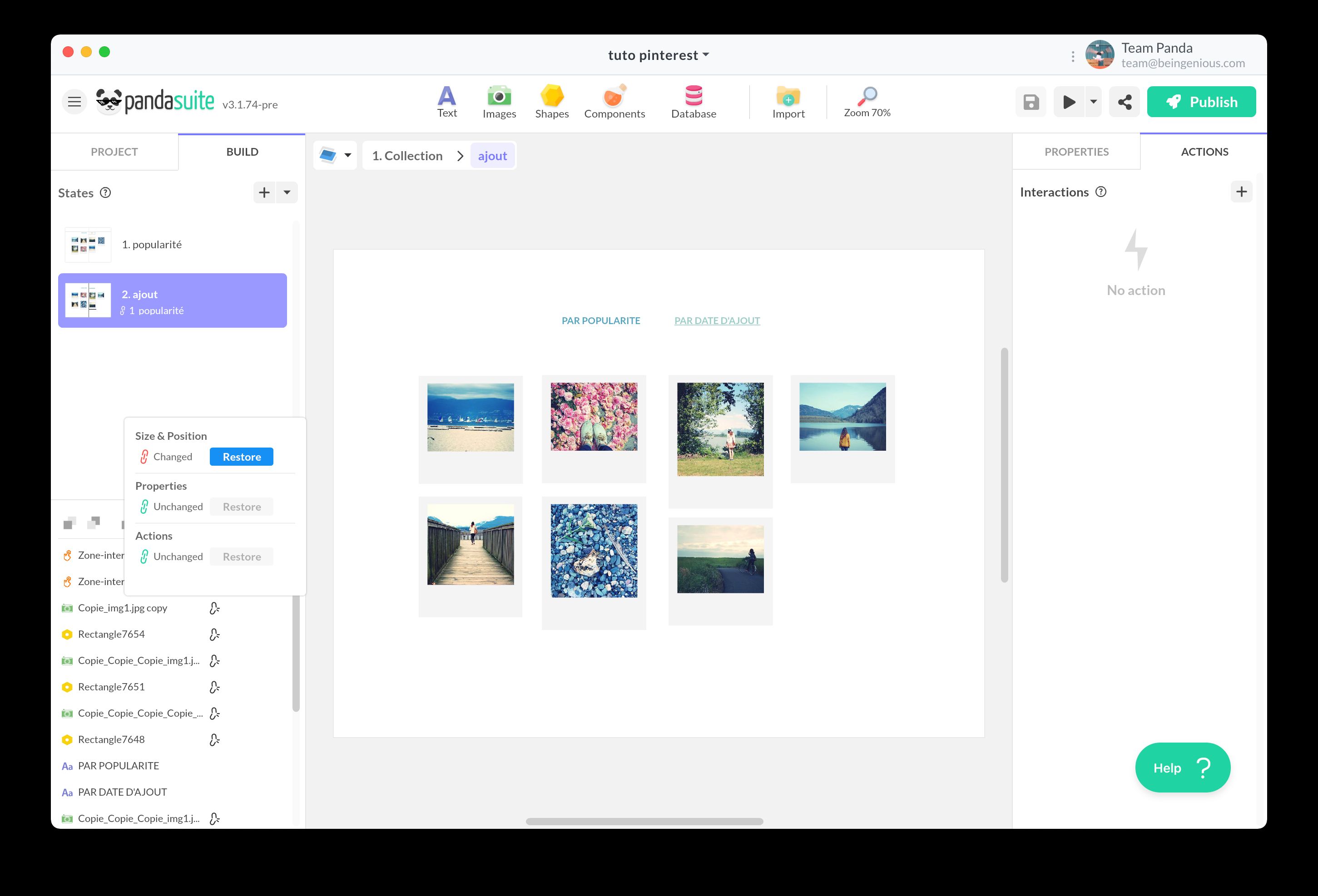
In this window, you will see link icons for each object. If a link is broken, you can restore it manually.
Beware of actions that break links!
Links between states are automatically broken if you:
- Import a new object directly into the linked state (instead of adding it to the parent state)
- Copy-paste an object into the linked state
When a link is broken, the object becomes completely independent and can no longer be animated during transitions.
Solution: always add your objects to the parent state, then modify them in the linked state if necessary.
Elements that can be animated
You can create transitions with:
- Images: position, size, opacity, rotation, mask
- Text: position, size, opacity, color (proportional scaling is not supported)
- Shapes: position, size, opacity, color, rotation
- Components: position, size, opacity, rotation
Triggering a state change
There are two main ways to move from one state to another:
Automatic change
For a state to change automatically (for example, as soon as the screen is displayed):
- Select the starting state
- Open the Actions panel
- Choose the Display State trigger
- Select the Change State action and choose the destination state
Change on user interaction
For a state to change following a user action (click, hover, etc.):
- Select the object that triggers the action (button, interactive zone, etc.)
- Open the Actions panel
- Choose the appropriate trigger: Tap / Click, Hover, Swipe, etc.
- Select the Change State action and choose the destination state
Customizing the transition
When configuring the action, you can customize the animation:
- Delay: waiting time before the transition starts
- Duration: animation execution time
- Animation type: acceleration curve (linear, ease-in, ease-out, etc.) or spring effect
To learn more about animation options: Animations
For the Multi-state component
If you use the Multi-state component, the procedure is slightly different:
- Select the trigger object
- Choose the Act on a Component action
- Select the Multi-state component
- Choose the desired action: Change State, Next State, Previous State, etc.
Default state
By default, the first state (State 1) is displayed when the screen first loads.
Behavior during navigation
When the user leaves a screen and returns to it, the screen displays in the last viewed state, not necessarily in State 1. This behavior helps maintain navigation context.
Forcing a state on return
To make a screen always display in a specific state on each visit:
- Select the desired state
- Click the pin icon 📌 in the states panel
- Or set it in the Properties window
Once configured, this state will systematically display, even if the user was in another state during their last visit.
Deleting a state
To delete a state, click on the trash can icon in the states panel.
Caution before deleting!
If you delete a parent state (the one that serves as a reference for a linked state), you risk losing the associated transitions. Always check the links between states before deleting.